The included RPG Maker MZ map tile style for interiors is not clear so I have had to spend time developing my own “visual” logic using the constraint of the included map tiles.
The interior map tile style places the viewer above a room at a slight angle to provide the illusion of three dimensions. Imagine taking the roof off of a doll house and looking inside at an angle. In this style, to indicate the boundary of an interior space and boundaries between rooms, they’ve dedicated a full tile for the “top” of each wall.
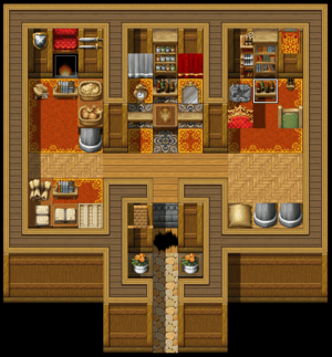
RPG Maker MZ Sample Map: House 1
The result is lack of clarity. As there is nearly as much area dedicated to boundaries as navigable space, distinguishing between the navigable and non-navigable spaces becomes challenging. This flattens the sense of dimension and could make basic navigation of the world unintentionally frustrating to the player.
As this viewer angle is quite common in JRPGs, I looked at an example for how boundaries were handled in a classic example, Chrono Trigger. In this game, negative space is used to indicate the boundaries of interior spaces:
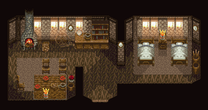
Chrono Trigger Example: Porre Elder's House
The result of this style is clarity and a more compelling sense of dimension. Most of the non-navigable tiles are the “background” walls which make up a significantly smaller area than the navigable space in the “foreground” helping to create a sense of dimension.
Here is the progression of how my visual logic has evolved:
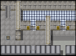
I eliminated wall-top tiling for sides of rooms
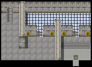
After reviewing examples from Chrono Trigger, I further eliminated viewer obstructing walls (the wall closer to the camera).
As I continue to work with RPG Maker MZ, I am curious what other internal "logics" I'm going to have to create given the tool's default resources and configuration. I'd like to continue working through these decisions as I think it will help me decided if this tool is the right for me.